
Manifest Options for Custom Blocks
Overview
Tapcart blocks allow developers to configure UI components using the manifest.json file. These options define how a block behaves, looks, and integrates with merchant data. This guide outlines the available manifest types and their configurations.
Manifest Types
Each manifest type allows different types of configuration. Below are the supported types with examples.
Asset Upload
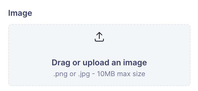
Allows users to upload assets such as images.
{
  "id": "image",
  "label": "Content",
  "type": "asset-upload",
  "description": "Drag or upload an image",
  "supportedFileTypes": ["image"],
  "defaultValue": {
    "url": "https://assets.tapcart.xyz/image-block/image/sample.png",
    "naturalAspectRatio": "string"
  }
}
Notes:
naturalAspectRatioshould be set based on the uploaded image.
Border Sides
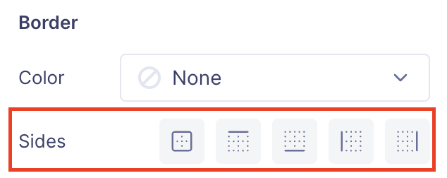
Controls which sides of an element have borders.
{
  "id": "borderSides",
  "label": "Sides",
  "type": "border-sides",
  "defaultValue": ["all"]
}
Allowed Values: "all", "bottom", "left", "right", "top"
Example Output:
{
  "borderSides": ["all"]
}
Notes:
- If the user does not want any borders, an empty array
[]is sent.
Collection List
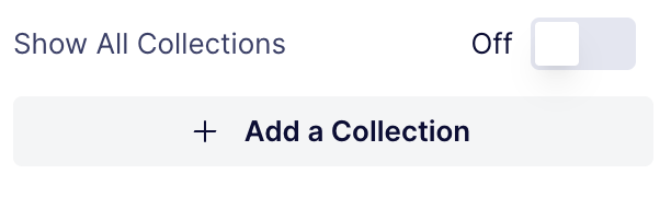
Allows users to manage a list of collections.
{
  "id": "collections",
  "label": "Content",
  "type": "collection-list",
  "enableAllCollectionsOption": true,
  "defaultValue": {
    "allCollections": true,
    "collections": []
  }
}
Notes:
- If
allCollectionsistrue, all collections are selected.
Collection Selector
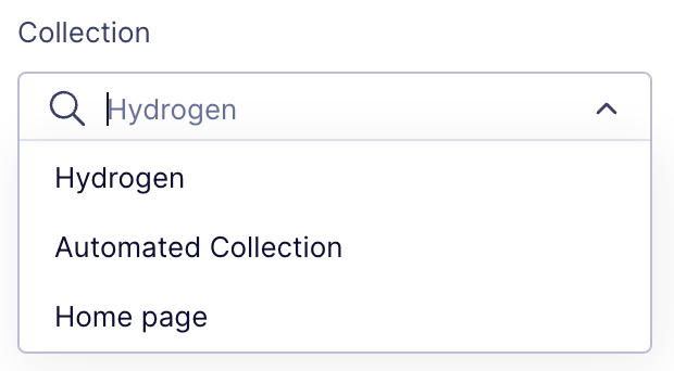
Allows users to select a specific collection.
{
  "id": "collectionId",
  "label": "Collection",
  "type": "collection",
  "defaultValue": "12343543543"
}
Example Output:
{
  "collectionId": "12343543543"
}
Color Select
Allows users to select a color.
{
  "id": "color",
  "label": "Color",
  "type": "color-select",
  "defaultValue": {
    "type": "brand-kit",
    "value": "coreColors-secondaryIcon"
  }
}
Example Output:
{
  "color": {
    "type": "brand-kit",
    "value": "coreColors-secondaryIcon"
  }
}
Notes:
- Custom colors are saved as HEX values.
Conditional Selector
Dropdown for selecting conditional options.
{
  "id": "conditionalType",
  "type": "conditional-selector",
  "label": "Condition Type",
  "defaultValue": {
    "productTag": [],
    "productName": [],
    "productMetafield": []
  }
}
Date-Time
Date and time picker.
{
  "id": "timestamp",
  "label": "End Time",
  "type": "date-time",
  "defaultValue": "__now__"
}
Notes:
- Stores
__now__in the manifest. - API reads and replaces
__now__withDate.now().
Destination
Defines navigation destinations.
{
  "id": "destination",
  "label": "Destination",
  "type": "destination",
  "defaultValue": {
    "type": "none",
    "location": ""
  }
}
Format for Each Type:
| Type | Description | Example location Value |
|---|---|---|
"none" | No destination. | "" |
"product" | Navigates to a product page. | "123456789" (Product ID) |
"collection" | Navigates to a collection page. | "123456789" (Collection ID) |
"url" | Directs users to an external URL. | "https://www.tapcart.com" |
"custom-screen" | Navigates to a custom screen. | See below |
Custom Screen Location Formats:
- Web-based:
"/hybrid-pages/:id" - Block-based:
"/blocks-page/:id"
Example Configurations:
{
  "destination": {
    "type": "product",
    "location": "123456789"
  }
}
{
"destination": {
"type": "url",
"location": "https://www.tapcart.com"
}
}{
"destination": {
"type": "custom-screen",
"location": "/hybrid-pages/123"
}
}Notes:
- When
typeis"none",locationshould be an empty string (""). - Ensure
locationmatches the required format for eachtypeto avoid navigation errors.
Divider
Adds a visual divider.
{
  "type": "divider"
}
Font Select
Allows users to select a font.
{
  "id": "font",
  "label": "Font",
  "type": "font-select",
  "defaultValue": {
    "family": "initial",
    "weight": "initial"
  }
}
Header
Used for section headers.
{
  "type": "header",
  "label": "Typography"
}
Horizontal Alignment
Aligns elements horizontally.
{
  "id": "horizontalAlignment",
  "label": "Horizontal Alignment",
  "type": "horizontal-alignment",
  "defaultValue": "left"
}
Allowed Values: "left", "middle", "right"
Icon Select
Allows users to choose an icon.
{
  "id": "icon",
  "label": "Icon",
  "type": "icon-select",
  "defaultValue": {
    "type": "internal",
    "url": "menu-icon-heart"
  }
}
Example Output:
{
  "icon": {
    "type": "internal",
    "url": "menu-icon-heart"
  }
}
Padding
Configures padding values.
{
  "id": "padding",
  "label": "Padding",
  "type": "padding",
  "defaultValue": {
    "top": 8,
    "bottom": 8,
    "left": 16,
    "right": 16
  }
}
Page
Defines a separate configuration page.
{
  "id": "searchInput",
  "label": "Input",
  "type": "page",
  "defaultValue": true,
  "hideVisibility": false
}
Range
Slider UI for selecting numeric values.
{
  "id": "cornerRadius",
  "label": "Corners",
  "type": "range",
  "defaultValue": 4,
  "min": 0,
  "max": 50,
  "unit": "px",
  "step": 1
}
Section
Creates a collapsible section.
{
  "id": "productTitle",
  "label": "Product Title",
  "type": "section",
  "defaultValue": true,
  "manifestOptions": [
    {
      "type": "header",
      "label": "Typography"
    }
  ]
}
Select
Dropdown or inline selector.
{
  "id": "layoutType",
  "label": "Layout Options",
  "type": "select",
  "defaultValue": "below-image-on-right"
}
Tab
Controls UI tab states.
{
  "id": "blockTab",
  "type": "tab",
  "label": "Block"
}
Text
Configures text fields.
{
  "id": "text",
  "label": "Placeholder Text",
  "type": "text",
  "defaultValue": "Search"
}
Text Alignment
Aligns text within an element.
{
  "id": "textAlignment",
  "label": "Alignment",
  "type": "text_alignment",
  "defaultValue": "left"
}
Allowed Values: "left", "center", "right"
Toggle
Boolean toggle switch.
{
  "id": "uppercase",
  "label": "Uppercase",
  "type": "toggle",
  "defaultValue": false
}
Vertical Alignment
Aligns elements vertically.
{
  "id": "verticalAlignment",
  "label": "Alignment",
  "type": "vertical-alignment",
  "defaultValue": "bottom"
}
Allowed Values: "top", "middle", "bottom"
Conclusion
These manifest options allow developers to configure React components dynamically within Tapcart's ecosystem. Use this guide as a reference when implementing your custom blocks.
Updated over 1 year ago